Dashboards that don’t just show, but think: up-to-date insights, AI-driven forecasts and limitless customization.
Data streams become decision streams
Whether IoT sensors, KPIs or AI forecasts: the dashboards of the hetida platform process millions of data points – without delay, without compromise. Visualize time series as vivid lines, KPIs as concise traffic lights or heat maps as interactive risk maps. All in a single view, under your control.
Dashboard for visualizing long-term measurement data over a period of 50 years. The locations of the measurement technology are dynamically marked on the overview map.
Drag & Drop:
Your logic, your visualization
Low-code, high-impact
Build dashboards like building blocks – by drag & drop, without code. Whether it’s water level data from a measuring station or power generation from your solar system and heating requirements for your districts: Choose from a variety of widgets, drag limit values, customize them to your liking.
Unlimited variants
Create dashboards for every target group within seconds – from technicians to management.
Light or dark mode
Create classic dashboards in light mode or use the more modern dark mode for the display.
Your users have the choice.
Dashboard Editor: Drag & Drop using the example of a hetida workflow.
Powerful time ranges & automatic updating
Comparisons at the touch of a button
Analyze “yesterday vs. today” or “planned vs. actual” with flexible time ranges – per dashboard or even per panel.
Automatic updates
Decide for yourself whether dashboards scroll live or wait for your command.
Shortcuts for quick thinkers
Jump to predefined time ranges such as “last hour”, “this week” or “this year so far” with one click.
Panels that can do more
Choose from a wide range of interactive panels – from classic line charts and heat maps to complex KPI widgets with a variety of configurable display options:
1
Time series diagrams
Discover trends, find outliers Visualize sensor data as precise curves, compare parallel currents in a diagram. Zoom and scroll through millions of data points at impressive speed.
Configuration of different time series in a diagram.
2
KPI panel
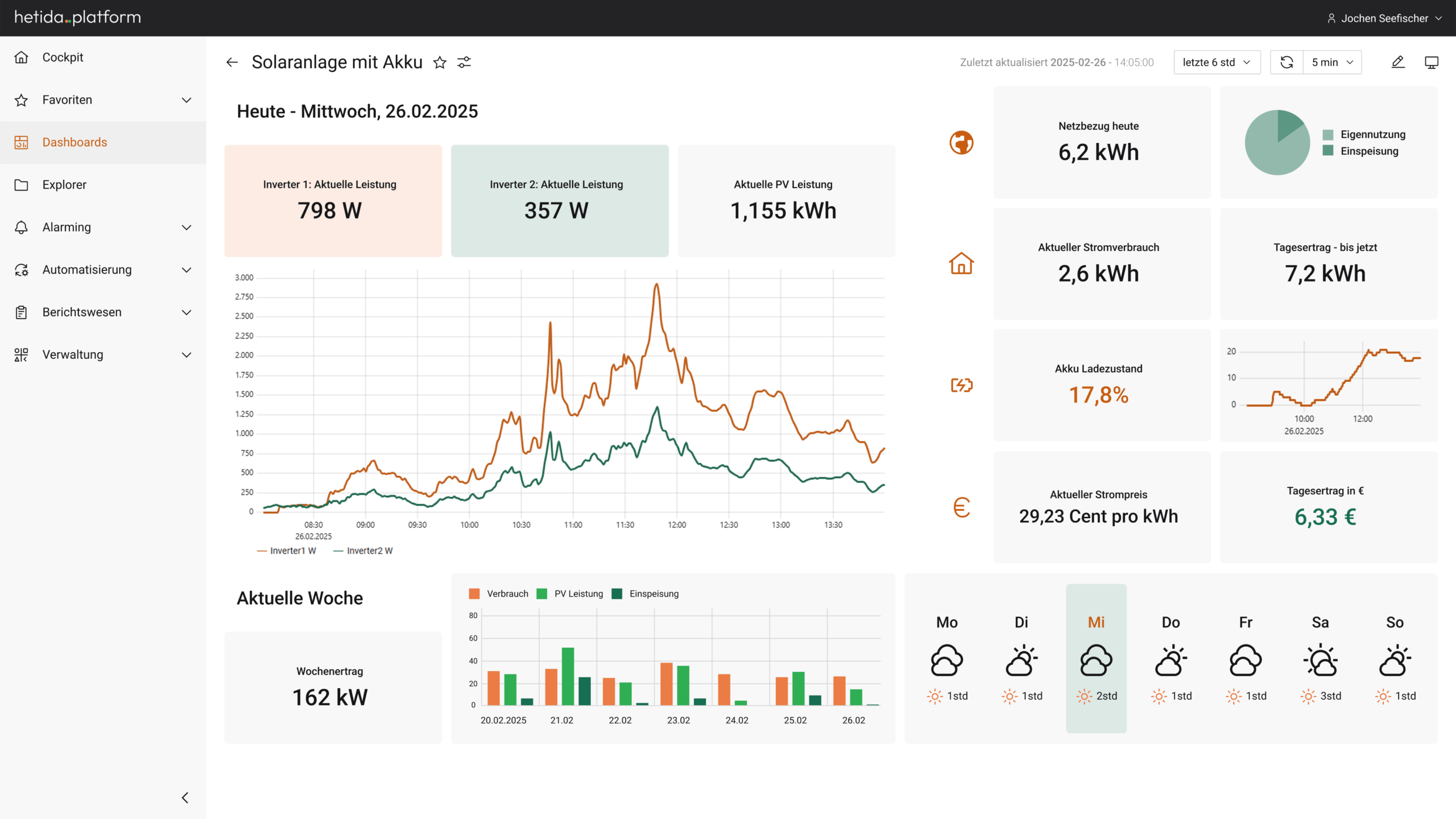
Numbers that alert Display key values as numbers, gauges or warning lights. Define any limit values with texts or color values to identify critical states at first glance.
Dashboard with KPI panel to visualize a heavy rain situation.
3
hetida designer
Workflow-Panel
Where data becomes aha moments Integrate the results of the powerful data science and machine learning tool hetida designer directly into the dashboard – be it a remaining service life forecast, an energy-optimized plant schedule or sales-optimized product placements. You can use the full Python data science stack, add your own code and connect existing components to create new workflows.
Configuration of a Markdown panel in preview mode. Markdown input on the right, the resulting display including formula mode on the left.
4
Markdown panel
Context is king Explain key figures with text, variables, formulas or links – if images are not enough.
Configuration of a Markdown panel in preview mode. Markdown input on the right, the resulting display including formula mode on the left.
5
Picture panel
A picture is worth a thousand words Show your presence by adding logos to your dashboards. Integrate your graphics in different formats directly into the dashboard.
Open dashboard editor with image and markdown panel.
6
Bar chart
Eye-catching comparisons Display production quantities, location comparisons or resource distribution proportionally.
Bar and line diagram for visualizing a heavy rain event.
7
Geodata panel
Understanding IoT globally
Show asset locations on maps, color-coded by status – e.g. “All pumps in region X with temperature > 80°C”.
Visualization of sensor faults on an overview map.
8
Heatmap panel
Make density visible Identify bottlenecks, risk clusters or usage patterns – whether in machine parks, warehouses or power grids.
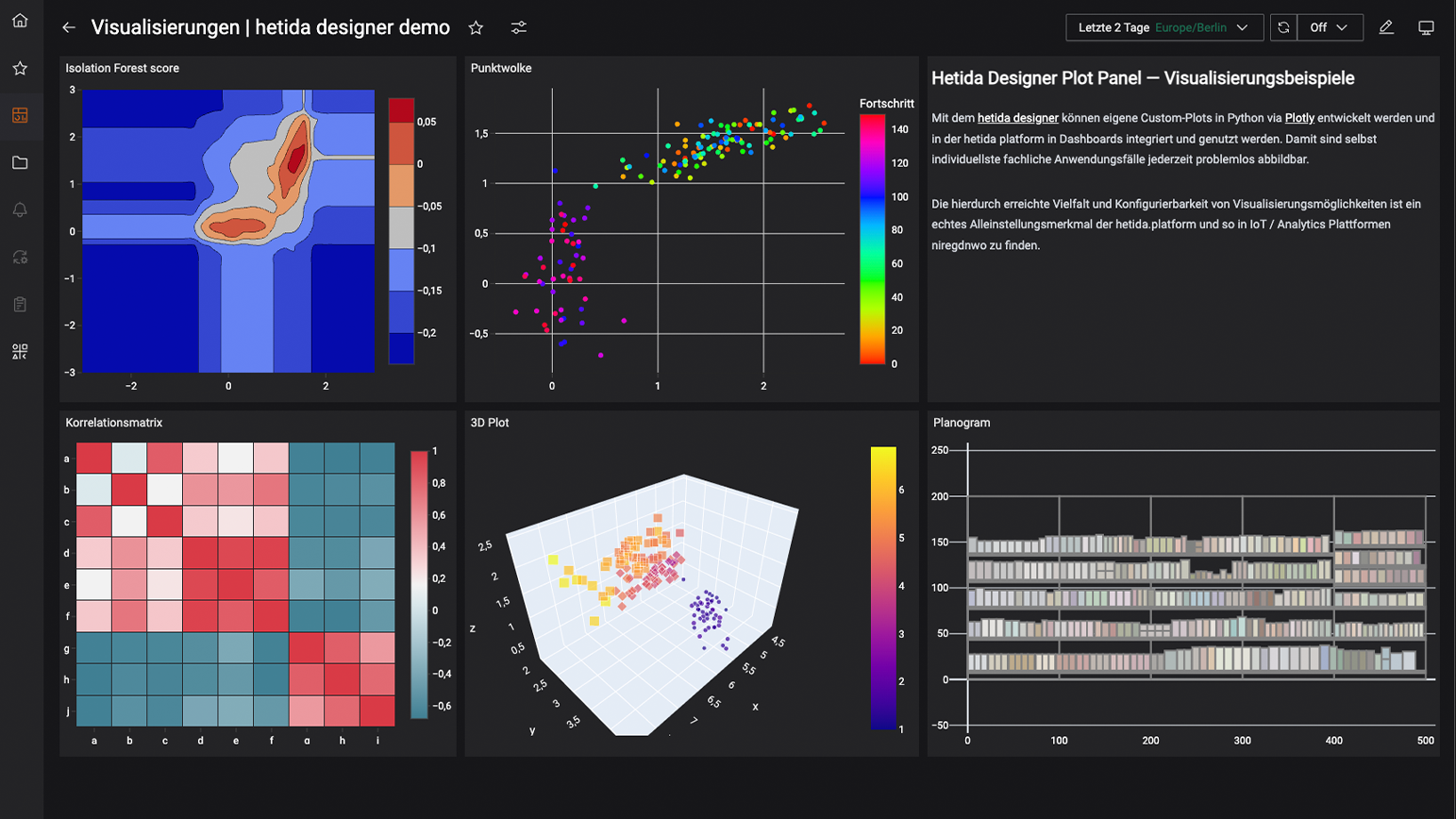
Overview of some of the many ways to present your data in an informative form.
Linking and public dashboards
Simply share your dashboards via browser link – publicly or via the authorization concept of the hetida platform.
Public links
Give external partners limited dashboard access – without having to create them in the platform. Create public dashboards – to give your customers insight into your productivity!
Authorizations at every level
Determine exactly who sees which dashbaords – “CEO sees total KPIs, technician only machine 12”.
Embedding
Integrate dashboards into internal portals or apps – via iFrame or API.
Performance that keeps up - even with big data
Thanks to state-of-the-art data processing and a scalable architecture, even huge amounts of data can be displayed in seconds and analyzed with AI workflows.
Experience how easily and efficiently you can analyze millions of data points and present them as actionable insights.
The hetida platform dashboards are designed to speed up your decision-making process and give you a clear competitive advantage.
Dashboards that not only inform,
but also inspire
Turn IoT data into decisions – as fast as your sensors measure.
Request a free demo now!
Experience the IoT and analytics platform live and make an appointment.
Our experts will get in touch with you shortly.
We look forward to hearing from you.
...don't miss anything - subscribe to our newsletter!
Request a free demo now!
Experience the IoT and analytics platform live and make an appointment.
Our experts will get in touch with you shortly.
We look forward to hearing from you.
Request a free demo now!
Experience the IoT and analytics platform live and make an appointment.